This is a brief snapshot of the brand guideline and icon work done at Rotolab during a summer internship. I focused on developing a brand system for the company based on their preexisting logo look/ style, and revving up their web presence through custom icons and a web design theme.
Rotolab Design Internship
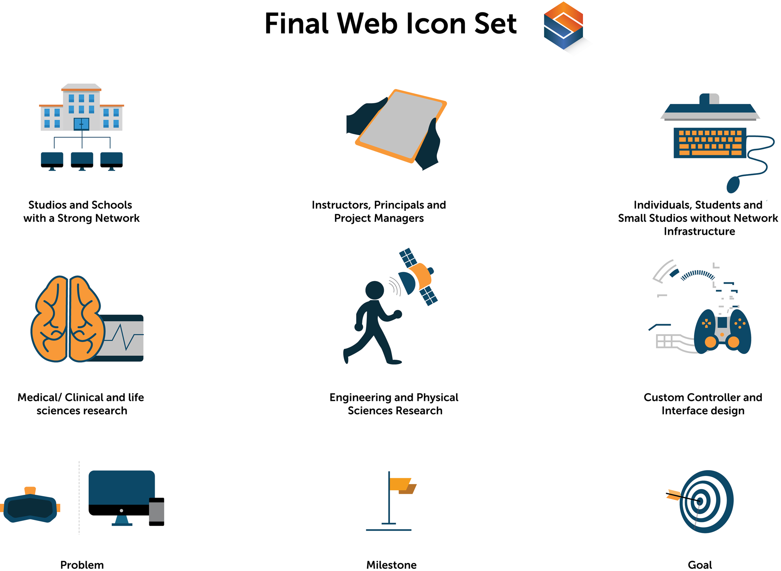
The icons underwent about 6 rounds of revisions. The final icon sets are detailed below:
During my internship, I created various presentation designs based on my research, sketches, and fleshed out design work. A brief snapshot of one of my final presentations is shown below:
I also created icons for Rotolab’s partner, Second Studio, during the internship. These were created in a much faster timeline because they were greatly influenced by the previous exploration conducted for Rotolab. The final set are shown below:


